Welcome to the Ryver Product Ideas forum!
We pride ourselves on constantly improving Ryver based on customer feedback. Here, you can view and vote on the current list of feature ideas, or add your own idea if you don't see it.
For immediate support...
Go to https://support.ryver.com and click the Chat tab in the lower left. You can also request help from inside the Ryver application via the Send Feedback link in the top drop-down menu in the nav bar.

 Show file descriptions, not file names in lists
The way it is now, the Posts column shows many of my files as "wfdocument.aspx", but the file list shows the understandable names. That is not exactly helpful. (And it is further complicated by the fact that the file list includes all files in the forum, so finding out what is connected where is almost impossible.)

 Allow to drag file names with links from browser directly into upload rectangle
The way it is now, we have to first create a copy of the link in the browser, go to Ryver and open the Link or URL dialog, paste the link, go back to the browser and select and copy the link description (visible text), paste it into the dialog and close it.

 Have the Files list show only the files for the presently selected post
The way it is now, all files for all posts in the forum are listed. It would be a great help if only the files for one post at a time were listed.

 Ability to Create a Post Template
It would be great to create templates or forms for repetitive communication or updates; so that system can prompt the user to complete specific information.

 #tag does not work with utf8
When a tag is written in utf8 characters, for example #παράδειγμα it is not searchable. Either clicking on the word or typing the tag to the search field, it does not return any results.

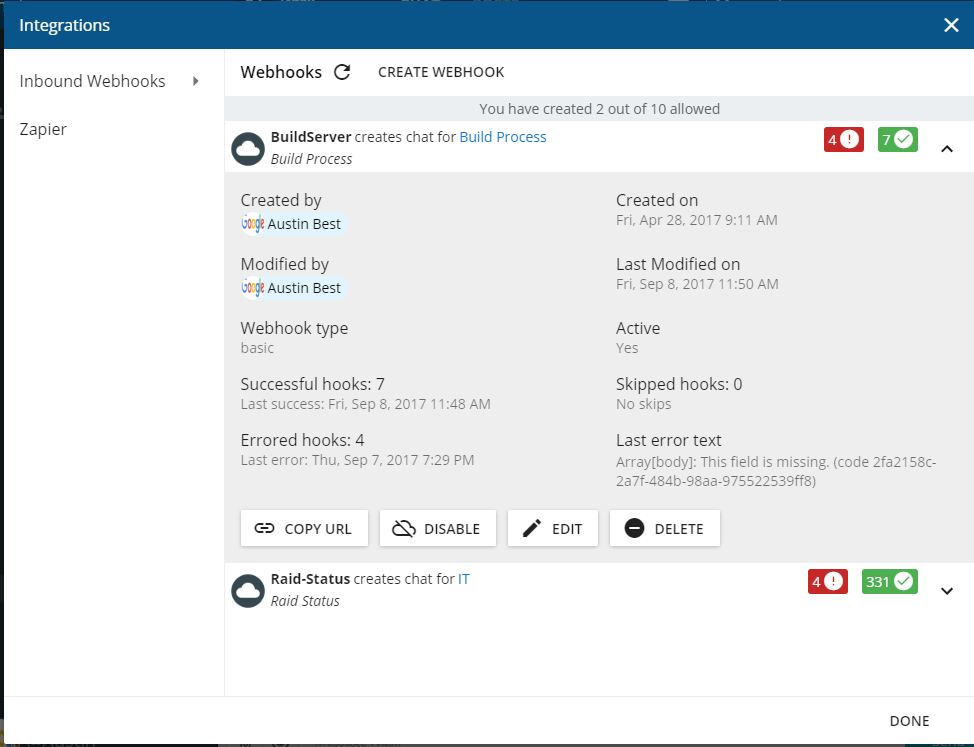
 Webhooks not updating
I had a webhook that was showing when it was last run and last failed. However it no longer is updating. It appears ever since i edited it, it stopped keeping track. As seen in the attached, it shows last success was 9/8 however it has posted at least 10 time successfully today (9/14) and multiple times through the week as well.

 Make the notification in a browser tab more noticeable
But anyway, currently the way the notification shows up on a browser tab is not noticeable at all. This may be completely subjective, but when I get a new message, I for the love of me cannot see the orange icon and waste a few seconds to find the right tab. What I would like to see to improve this is either:
don't change the Ryver icon to orange and instead make a small orange circle next to it, like this:
or show in brackets how many new messages you got, like in Gmail:
or both at the same time. :)

 Import a list of users to a team
We create teams often - is there a way to import a list of users into a team instead of adding them manually? Forexample, upload a text or excel sheet into the invite section of the team?

 Option to sort comments (within a post) with most recent first
I wish to see the most recent COMMENT first within a post.

 Desktop: Formating options
Have ability to change text size for chat and right column choices; decrease the amount of space between lines in chat as well as choices in right column; have ability to move line between choices and chat to see less of words in right column

 Working offline
As RYVER wish to place existing communication platforms, the #1 features we believe is crucial and is missing from RYVER at the moment, is working offline.
From the features you've made and the way they were implemented, I'm guessing you are using an online emails platform such as Gmail. This might be the case for certain users, however, many of us are using platforms like Microsoft Outlook.
Although it is not as popular as it is in Outlook, but Gmail also allows offline work.
We all travel a lot and find ourselves occasionally in disconnected areas. It can be up in the air, or simply in a foreign country with no data plan or local internet connectivity for certain hours.
Normally it's for considerably short periods, never the less, still time you would like to dedicate to work.
Here is a list of items we can all do offline using existing platforms, but not using RYVER:
(listed by priority)
1. Reading emails and content you didn't get the chance to get to.
2. Reviewing and working on attachments sent to us.
3. Writing emails and sending them (they will be sent automatically once connection resumes)
4. Review and work on tasks
5. Managing emails/files/folders - move/copy/delete/archive
6. Writing emails and saving them to Drafts for later usage.
We found that certain personnel in the company, mostly higher management, sales, and field engineers which frequently complain about this, and are using it as a reason for why they can't switch from an email platform to working on RYVER and using it for crucial stuff.

 Mark chats which are promoted to a post
I like the ability to promote chats into a post. However, there is no way to tell from the Chat page that a particular message has been promoted into a post. I have a few ideas for how this might be done, but none are completely satisfactory. I'll mention 2 of them here:
1. For promoted messages which are sequential, add a visual like what Twitter uses for threaded messages (they are connected with a gray vertical line). Then, at the end/bottom, include an ellipsis button or some other icon which links to the corresponding Post. Pros: visual clarity and intuitiveness (in my opinion). Cons: Not clear how this would work when non-sequential chat messages are promoted, or when a message is promoted into more than one chat.
2. Include an option in the ellipsis menu (or an icon on the mouseover menu with Reply and Create Post) for chat messages called "View posts based on this message" or something similar. Pros and cons are switched from my first suggestion. In particular, I would still like to see a visual indication that a chat message was promoted.

 Collapse replies
I don't know if this has been already posted, but I see no way to collapse all the reply into one single line, the original, so all replies, after I no longer need them or already read them all, does not occupy so much chat space.

 Create a separate list of or a tab with, replies/threads
When replying a conversation, or thread, is created. It would be great to be able to access them, the thread outside the forum, so one can follow each of them in different positions within the UI, in different panes or sections.
Customer support service by UserEcho


