Welcome to the Ryver Product Ideas forum!
We pride ourselves on constantly improving Ryver based on customer feedback. Here, you can view and vote on the current list of feature ideas, or add your own idea if you don't see it.
For immediate support...
Go to https://support.ryver.com and click the Chat tab in the lower left. You can also request help from inside the Ryver application via the Send Feedback link in the top drop-down menu in the nav bar.

 android - links in post not working
andoid 5.0 samsung s5
external links in a post work well but not those related to a ryver post

 invite teammates to a new private team at once
Invites all teammates from a private team to a new one using @team (instead of adding each manually)

 @team notifications
In private team/chat, i sent a message @team but got no notification by email. And yes, i'm part of the teammates.

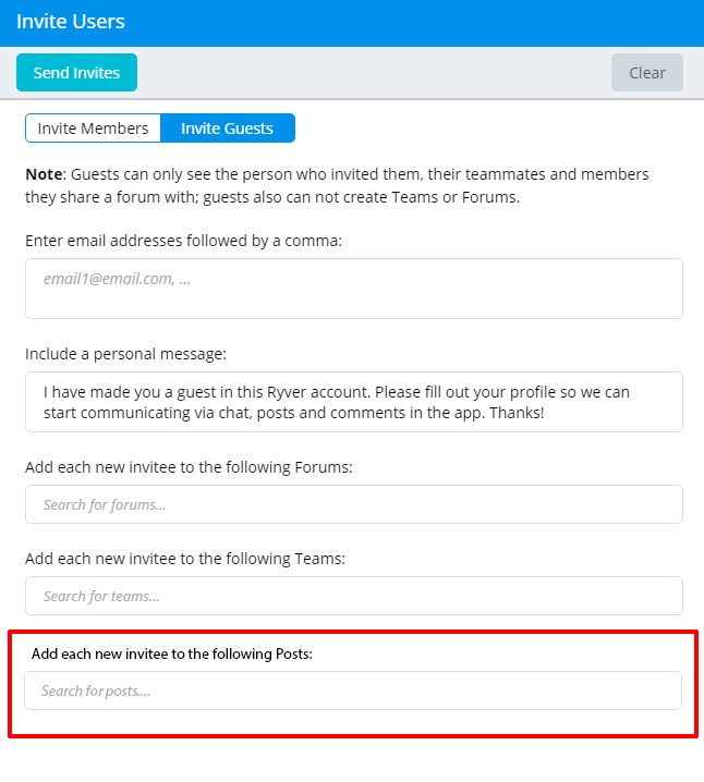
 Private Teams - Invite guests to a post
If you invite a guest to a private team, s/he can read all posts.
To solve that issue, add below field to invite guests to a post only.

 Email invites
Once new members get an email from DEMO (this is just an example)
Instead of
Please join me -> Join DEMO
I have made you a member of this Ryver account -> I have made you a member of DEMO
Click here to join me -> Click to join
Account Name: DEMO -> demo.ryver.com
All the rest is ok. Otherwise it's a little confusing :)

 Increase font size in the Linux desktop client
The font size for a high resolution screen is quite small. Hope there is a way (even a workaround) to increase the font size.

 Windows app resets login details when loses focus
Click into a password safe and back again it clears the login form. Rather irritating.

 Have the account color selected propagate visually throughout application
If I select gray, for example, for the Account, the titles of a private team are still blue. With multiple accounts, it would be nice to reflect the account that is currently selected. Ideally, it would also let you select the font color too.

 Execute commands as notifications
I think it could be nice to be able to choose to have your Ryver client execute a command when you get a notification/message. Primarily the reason for this is that I'm interested in making a notification that is more clearly visible. However a feature like this could be used for a lot of other tings as well, if you add the possibility of parameters like the ability to pass the message/sender/team to the command a lot of possibilities would open op for quick and simple integrations.

 Right click to correct spelling
Currently the Ryver desktop app shows that a spelling mistake has been made, but there's no way to easily fix it. In the browser (Chrome), I can right-click the word and it offers a way to correct the misspelled word with suggestions. I would like to see that same functionality in the Ryver Desktlp app.

 Windows client won't start mimimized
The windows client won't start minimized even if I tell it to through the shortcut properties.

 Introduce the concept of a "personal" organization which becomes the user in other organizations.
This would facilitate a) the ability to see all of my conversations in a single org, relevant to me and b) the ability to orchestrate conversations in an adhoc fashion across orgs and/or people. For example, if I'm a customer who is invited to one or more teams, across one or more vendors, I could interact with them in my personal org. If I wanted to introduce my golfing buddy as an outside resource to an internal (my company) opportunity, the golfing buddy should need to locate and enter yet another org. This is the Vendor Relationship Management approac to creating a grass-roots adoption a la Doc Searles. Just a thought

 Allow admins to view direct messages
As an admin, I'd like to be able to view all direct messages.
This request is closely related to the request "Allow Admin to see and manage ALL teams, not just the ones they are on" http://feedback.ryver.com/topics/14-allow-admin-to-see-and-manage-all-teams-not-just-the-ones-they-are-on/

 Putting "Search" in a conventional location in the desktop app
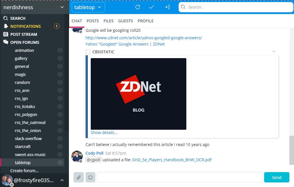
I would like to suggest moving the search bar, refresh icon, multi-select icon, and the online users toggle icon. It would seem to me better to have them in a convnetional place like many search bars are in the top right corner. It removes the trapped space around the "Chat" "Posts" bar, and it frees up some real estate for the actual chats themselves.

 Unique Desktop Notification Icon
This may be a Windows-only issue, but currently the desktop pop-up notifications for Ryver use the same blue circle with an 'i' in the middle symbol as general Windows notifications.
This means that it's sometimes hard to tell out of the corner of one's eye if something is a Ryver pop-up or some kind of dull system notification. It would be great if it could be changed to a custom Ryver-only icon that's distinct enough from the Windows one to be easily distinguished.
Customer support service by UserEcho


