0
Under review
Better visual cues for the forum/team you are chatting in, or visual cues showing if a discussion is private
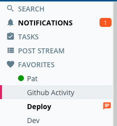
When you have a large list of discussions on the left, the one you are engaging with should be highlighted more clearly.
Also, it would be nice if there were a visual cue, such as a different background color, to indicate when you are in a private discussion. (Perhaps forum/team creators can even set the background to something unique?).
It would make it more obvious straightaway where you are chatting.
Customer support service by UserEcho


For the first part, are you saying you don't find it easy enough to see the different background color and red/pink selection indicator for the selected tab?

Regarding backgrounds, we have been talking about possibly providing a per-team/forum option to set the background color, which would apply across all sub-tabs for that team or forum, including our up-coming task boards. It sounds like you would like to see an option that is more based on "open" vs "private", or would a per-team/forum option work for you?
Rzeczywiście Nie ma wielu dużych kasyn internetowych. Jeśli spojrzysz na kasyno Verde casino, będziesz pewien, że jest to coś, co może pomóc ci przestać wykonywać pracę, której nienawidzisz, Tam znajdziesz https://verdecasinobonus.com/pl/ największą liczbę różnorodnych gier, od gier stołowych po gry slotowe.