+1
Under review
Improve interface and usability with posts.
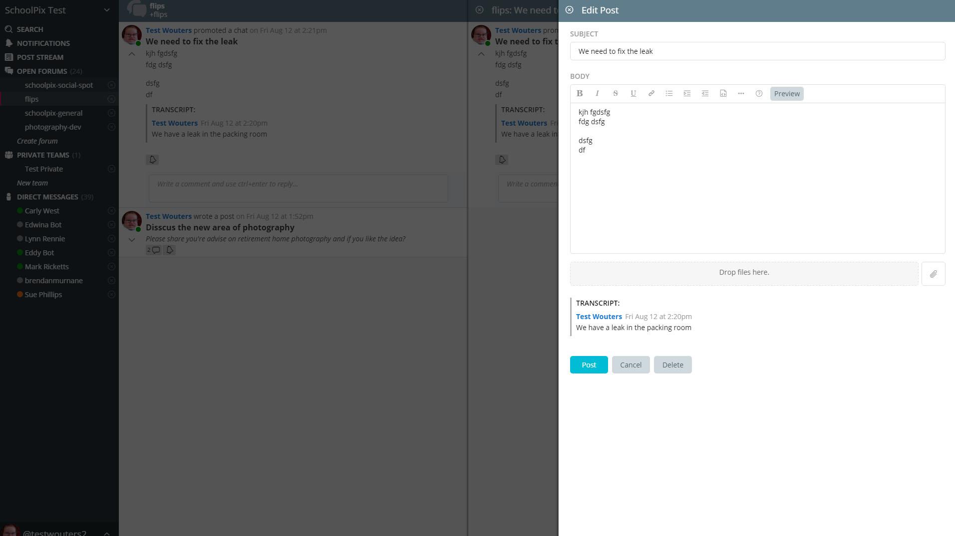
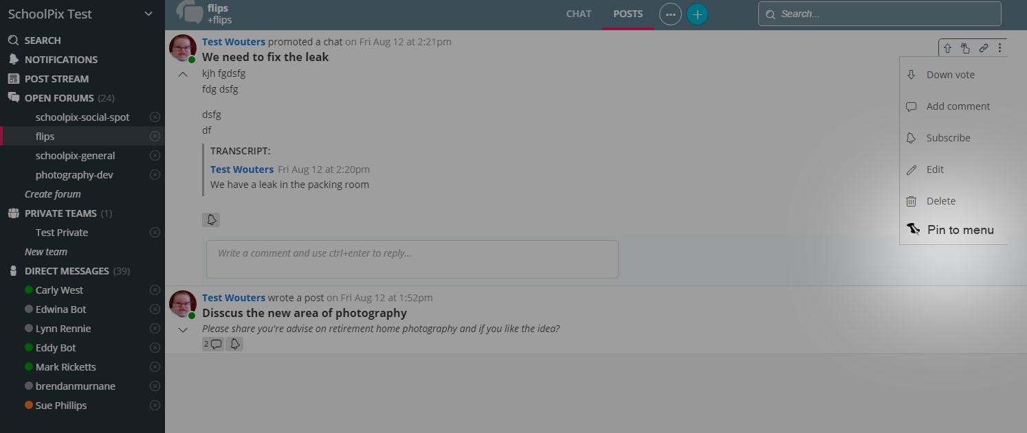
My users find the interface confusing when up to 3 boxes pop out from the right of screen when clicking on posts. If the underlying interface greyed-out, it would make it much clearer to users what they were looking at.

Greyed-out underlying window would help users understand they are editing the post.

Also confusion to why the same post pops out from the right when you click on a post title? Very Confusing!

Very randomy, some posts would apear pinned to the menu, however I can find no way to recreate it.
Customer support service by UserEcho


Note that we plan to move Add Post to either a pop-up dialog or inline form. With a pop-up dialog, the background would be de-emphasized.
Regarding the opening of the Post Detail view when you click on the Header or Timestamp in the POSTS stream, this is similar to the way that Twitter works if you click on the timestamp for a tweet. For special posts like Shared Emails, the detail view is the only way to view the full content. For a regular post, sometimes people like to open the post in its own view just for viewing purposes. This can be handy on mobile, especially. This is the same detail view you see when you click to open a Post from a link in the CHAT tab.
We have talked about allowing Posts to be pinned in the nav bar. That might come with a "favorites/bookmarks" option.
An example of where a Post will open in a separate tab is when you have an in-progress chat message and you click to open a Post. We'll take another look at that...it probably isn't necessary.